Wine labels aren't (always) a mystery!
China remains one of the most promising markets for the wine industry. According to a recent study, the country is expected to be the second-largest consumer market in the world in 2021.
Franck Celhay, Montpellier Business School – UGEI and Josselin Masson, University of Montpellier

Major exporting countries must understand this customer base if they are to gain a foothold in the market. In particular, they need to consider creating label designs that are as “eye-catching” as possible.
Indeed, it is generally accepted that the graphic choices made in packaging design help convey values, a promise, or even a brand story to consumers. However, one question remains: How is this visual language understood when the packaging is exported to a culturally different country, such as China?
Signs That Are Understood Across Cultures
To answer this question, we conducted a study exploring how Chinese consumers interpret eight wine label designs. These eight labels, created by a French graphic designer, are intended to convey eight brand narratives frequently observed in mainland China: “festive” wine (bottle 1); “romantic” (bottle 2); “traditional” (bottle 3); “liberating” (bottle 4); “natural” wine (bottle 5); “rustic” wine (bottle 6); “poetic” wine (bottle 7); and finally, “château” wine (bottle 8).
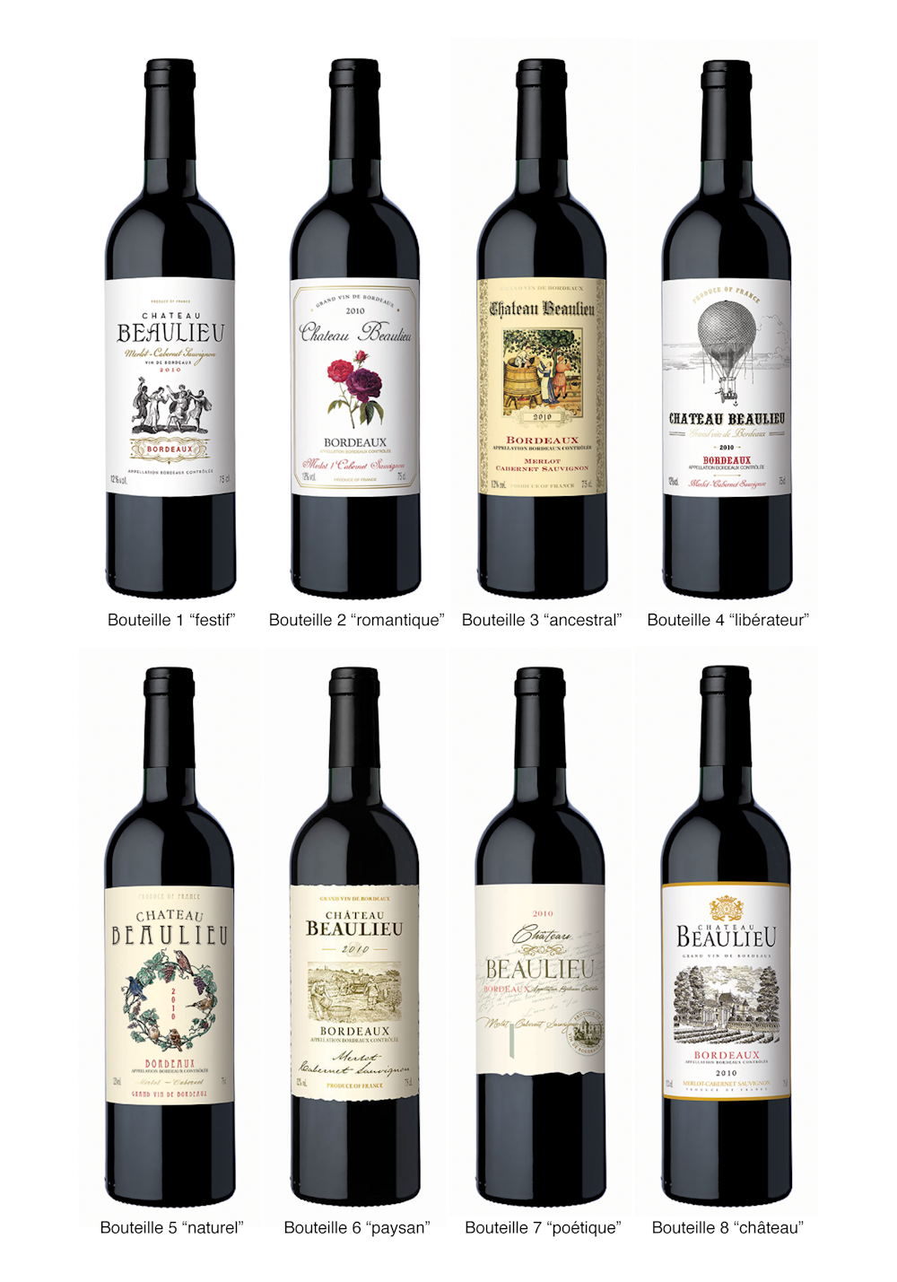
Two empirical studies were then conducted with Chinese consumers to assess their perceptions of wine bottles using a free word association task. The first study was conducted with a sample of 1,391 consumers of imported wines with labels indicating the origin “Bordeaux.” The second study was conducted with a sample of 795 respondents, including non-wine drinkers, using labels where the wine’s origin was masked (see Figure 2).

For each study, respondents were asked to evaluate 4 bottles presented in random order. A total of 5,564 and 3,180 responses in Mandarin were collected in the two studies. The responses were translated from Mandarin into English and then analyzed using the Sphinx Quali software (see Figure 3).
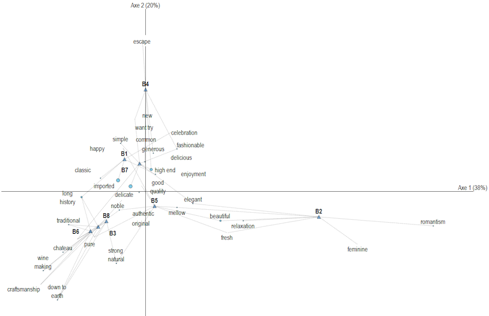
The map shown in Figure 3 is interpreted as follows: the positions of the various bottles are indicated by triangles and labeled B1 through B8. The words on the map indicate the different associations of ideas generated by the various bottles. When the bottles are far apart on the map, it means they generate different associations of ideas and are clearly distinct (for example, B4 associated with the theme “escape ” or B2 associated with the theme “romance”); when the bottles are close to one another on the map, it means they share a number of associations and convey similar brand images (for example, B3, B6, and B8 are associated with the themes “tradition” and “history”).
The Meaning of Signs
The results show that, for 7 of the 8 bottles tested, Chinese respondents were able to understand the French designer’s communicative intent—even among those who were unfamiliar with both wine culture and Western culture.
The explanation lies in the fact that the seven “understood” bottles use “motivated” signs, while the “ununderstood” bottle uses “arbitrary” signs . A motivated sign is one whose meaning is based on a certain logic. It is therefore possible to guess its meaning without having been taught it beforehand. Such signs can remain intelligible across cultures. Conversely, an arbitrary sign is based on a cultural convention and is not grounded in any form of logic. Therefore, it is not possible for someone from another culture to guess its meaning.
For example, Bottle 3 (the “ancestral” wine) is spontaneously associated with themes such as “age” and “tradition” (Figure 3). This bottle uses yellowed paper for its label. This is an example of a motivated sign because paper yellows over time. The association between “yellowed paper” and the concept of “age” is therefore based on a form of logic that remains intelligible to any culture familiar with paper production.
Conversely, to convey the idea of a “poetic” wine (bottle 7), the designer chose to reproduce a poem on the label in a flowing script font that evokes an artist’s handwriting. From the perspective of Chinese respondents, neither the reproduction of the poem nor the typeface can be considered examples of meaningful signs. With the exception of those who have learned French, Chinese consumers cannot read the label’s content and therefore cannot understand the poetic nature of the reproduced text. Similarly, they cannot grasp the meanings associated with different styles of Latin typefaces since they use a different writing system.
"Localized" Packaging Under Scrutiny
These findings are interesting because they challenge: (1) the notion that visual symbols necessarily have different meanings across cultures, and (2) the resulting recommendation that it is essential to “localize” packaging—that is, to adapt its design to the various cultures to which it will be exported.
This idea is generally based on the well-known example that the color white is associated with positive meanings in Western countries (such as purity) but with negative ones in Asian countries (such as death). While this example has the merit of being striking and drawing attention to the concept of cultural differences, it is also overly simplistic and therefore leads to a general recommendation (to localize packaging) that is not always relevant.
In most cultures, colors have both positive AND negative meanings, which may or may not be activated depending on the context and how they relate to other symbols. For example, white can ALSO symbolize death in the West, as seen in the visual representation of near-death experiences (a white light at the end of the tunnel) or ghosts (a white shroud). Furthermore, in many market situations, consumers (whether Asian or Western) seek out products they perceive as exotic. Localizing the packaging in such situations results in a loss of perceived authenticity and diminishes the product’s appeal.
Our findings show that packaging design can remain understandable across very different cultures if it uses meaningful symbols. It is therefore possible to create a design that remains true to its origins while also being understandable in export markets.
Furthermore, the results indicate that Chinese consumers may appreciate label styles other than the classic “château” wine (see Bottle 8). In fact, all labels are associated in equal proportions with the themes of “high-end” and “good quality” (in the center of the chart shown in Figure 3). It therefore seems possible to diversify the positioning strategies for French wines by adopting a wider variety of label designs. This would make it possible to better respond to the diversification of Chinese consumer segments, as revealed by various recent studies.
Peiyao Cheng, a researcher in the Department of Design at the Harbin Institute of Technology, and Wenhua Li, a researcher at the Guangzhou Academy of Fine Arts, contributed to this article.
Franck Celhay, Associate Professor, Montpellier Business School – UGEI and Josselin Masson, Associate Professor of Marketing, University of Montpellier
This article is republished from The Conversation under a Creative Commons license. Readthe original article.